WGP: Built by hand, driven with heart
Collaborators
Design Director
Heather Martin
Design Lead
Nil Thyrion
Senior UX designer
Tushar Merwanji
Senior Designer
Niamh Evans
Responsibilities
Motion Design, Identity Design, Art direction, UI Design
Software Used
Figma, After effects, Illustrator, indesign, Photoshop, Premiere pro
Overview
Compare the Meerkat’s digital experience had become fragmented across TV, social media, and web, losing cohesion and brand personality. The digital channels were attempting to translate adverts rather than designing for how users interact online. The personality of the meerkats had been diluted, creating an inconsistent and disconnected experience that needed to be reimagined.
Response
Alongside redesigning the digital experience, we reimagined how the brand translates online. Research showed most brand equity comes from the meerkats, so we explored championing them across all touchpoints and evolving the brand name to “Meerkat.” By evaluating the brand pillars and introducing a new “furry” principle, the conceptual work laid the strategic and creative foundation for what the brand’s digital presence could become, unifying channels and guiding the next evolution of branding and production.
Response
Alongside redesigning the digital experience, we reimagined how the brand translates online. Research showed most brand equity comes from the meerkats, so we explored championing them across all touchpoints and evolving the brand name to “Meerkat.” By evaluating the brand pillars and introducing a new “furry” principle, the conceptual work laid the strategic and creative foundation for what the brand’s digital presence could become, unifying channels and guiding the next evolution of branding and production.
Purposeful Palette
Reworking the colour system, I introduced greater clarity, consistency, and personality across the digital experience. I defined distinct category colours to improve navigation and content recognition, and evolved the palette towards a brighter, more playful world for the meerkats, moving away from dated Russian-inspired interior cues. I also established a single, consistent CTA colour to increase action visibility and strengthen usability across key user journeys.
Meerkat moments
I introduced moments of delight that bring the meerkats out of static imagery and into a more living digital experience. I designed small, expressive interactions that make them feel present and reactive within the app, giving greater prominence to the brand’s most recognisable asset. By weaving them into everyday user journeys, I added personality and created lighter touchpoints that help ease moments that might otherwise feel repetitive or stressful.
Fur system
With “Furry” as a core brand principle, I developed a set of fur patterns linked to key site categories, translating it into a functional design system. Each pattern reflects the character of its respective section, supporting navigation while strengthening brand identity. I applied them behind meerkat assets and as framing devices for content, adding texture, clarity, and personality across the experience.
Unified Icons
The existing icons felt disconnected from the wider brand, so I developed a new icon system anchored in the fur cut-out from the logo as a consistent visual device. I used this motif to reconnect iconography to the core identity while introducing a subtle, playful charm. The result is a more cohesive digital experience where brand elements work together seamlessly across the interface.
Motion principles
To bring consistency to the digital experience, I helped define how the brand should move. Drawing from the natural behaviour of meerkats, I established two core motion principles that guide animation across the system. These principles shape how meerkats appear and behave throughout the experience, creating consistent patterns for reveals, transitions, and interactive moments across digital components.
Ideas Alive
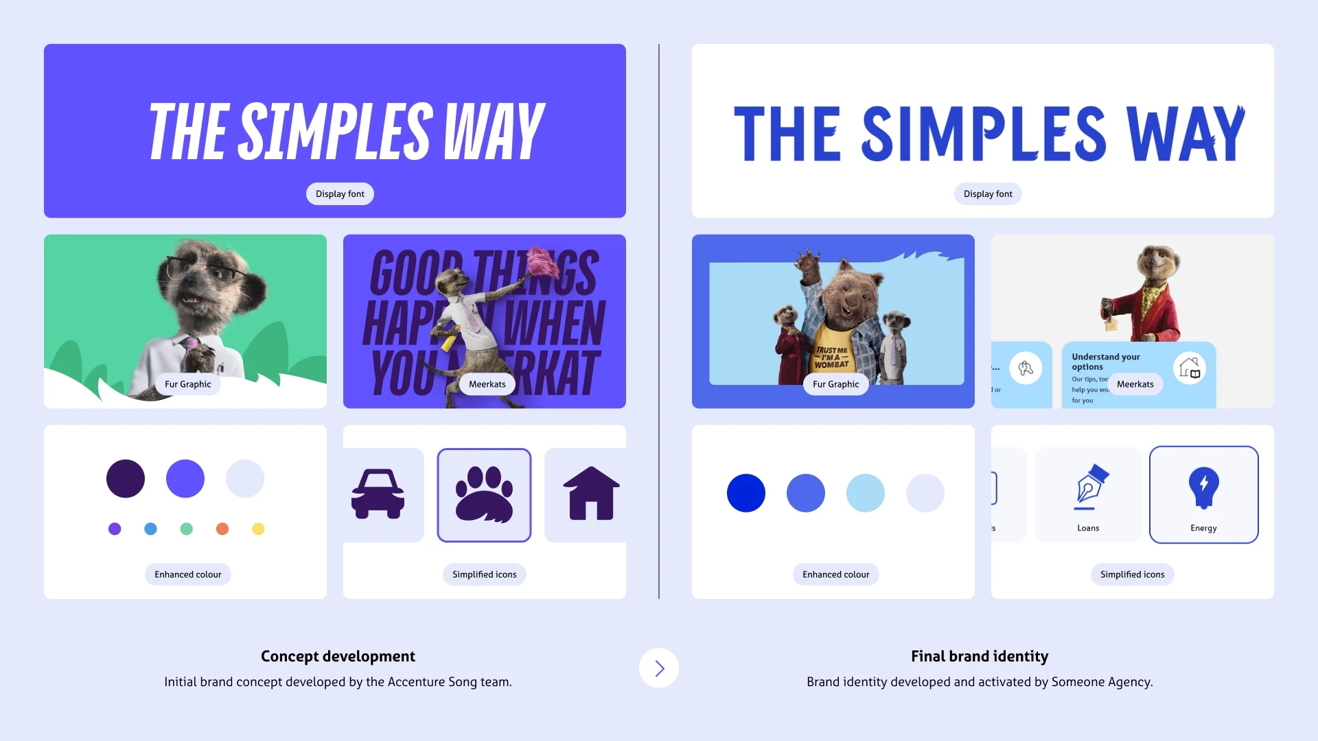
The concept established a new digital direction by championing the meerkats, introducing fur as a core brand asset, brightening the colour palette to match their personality, and using a display typeface to amplify their voice. The final identity, developed by Someone Agency, demonstrates how these ideas evolved into a cohesive brand.
Similar Projects

Compare the Meerkat: Channeling Meerkat Energy Through digital
Brand Identity | Motion | Digital
1.Problem
Compare the Meerkat’s digital experience had become fragmented across TV, social media, and web, losing cohesion and brand personality. The digital channels were attempting to translate adverts rather than designing for how users interact online. The personality of the meerkats had been diluted, creating an inconsistent and disconnected experience that needed to be reimagined.